Your church website is your virtual front door. Long before someone plans a visit, asks a question, or fills out a form, they make a decision about your church based on what they see on your church website homepage. And they make that decision fast.
How fast? About 0.05 seconds.
In less time than it takes to blink, people decide whether your church feels welcoming, trustworthy, or worth visiting at all. That is why a church website homepage has a very specific job to do. In fact, it has three of them.
Every church website homepage has three core responsibilities. Inspiration. Information. Invitation. When these three work together, your website becomes a tool that introduces people to your church and helps them take meaningful next steps in their journey with Jesus.
Below, I'm going to teach you the exact formula to build a church website homepage that earns attention and builds trust. Let's do this together.
Your First Job: Inspire
Inspiration is about first impressions, and first impressions on your website are made visually. The principle to remember here is simple: show, don't tell.
You know the phrase A picture is worth a thousand words? Well, it’s true. We can communicate in an instant with a single photo what would take paragraphs worth of text to say.
The research bears this out. Alongside the University of Basel, Google found that first impressions of a website are formed in 50 milliseconds or less. Websites with low visual complexity were perceived as more appealing, and users consistently preferred designs that felt simple and familiar.
No one is reading your About Us paragraph in 0.05 seconds. They are reacting to what they see. This is why clean design always wins.
For churches, this is not just a design strategy. It’s theological alignment.
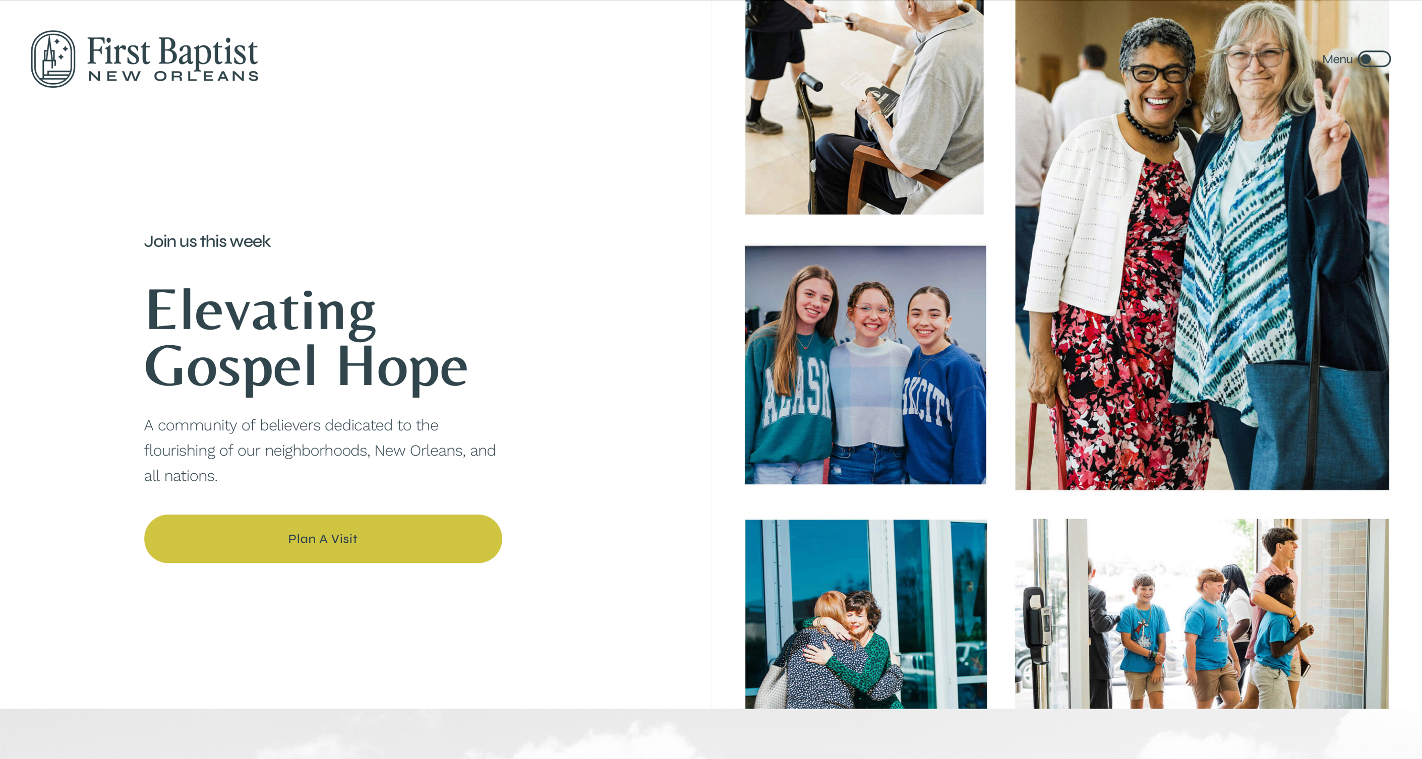
The Church is the people. The best photos you can put on your website are photos of your actual congregation. Real faces. Real moments. Real community.
Effectiveness only matters when it intersects with faithfulness, and showing your people in your space achieves both.
{{banner-1}}
The Most Important Section On Your Church Website
The hero section is the most valuable real estate on your entire website.
More people will see this section than any other part of your site, so it deserves focused attention.
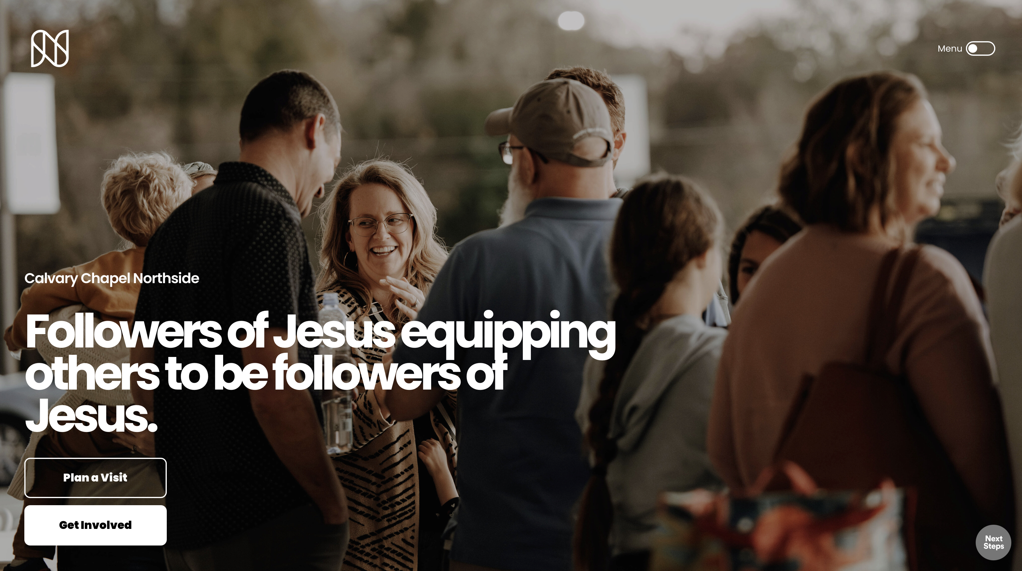
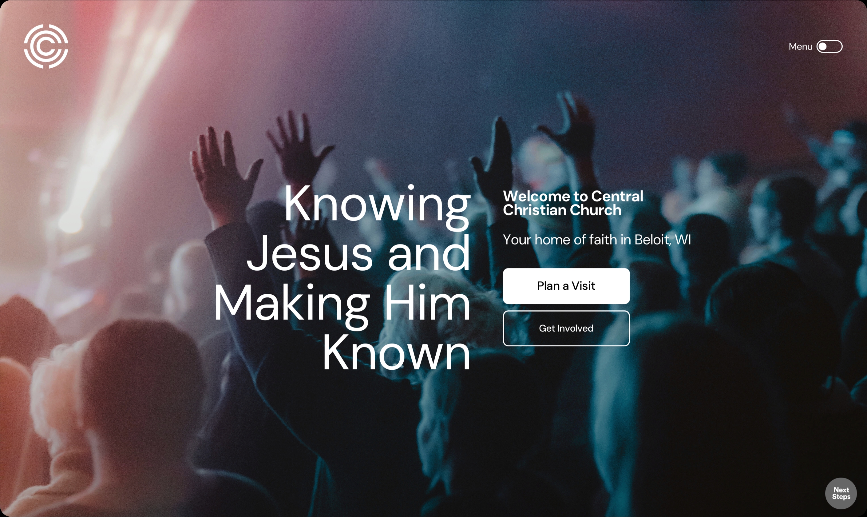
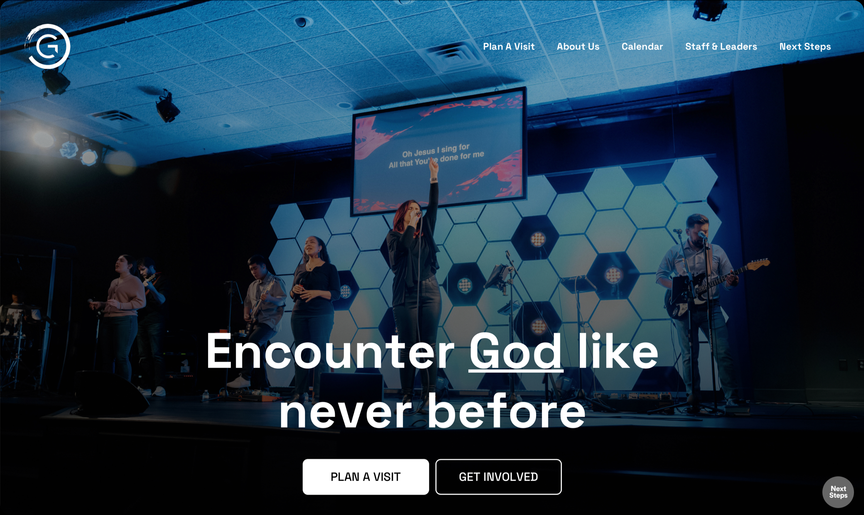
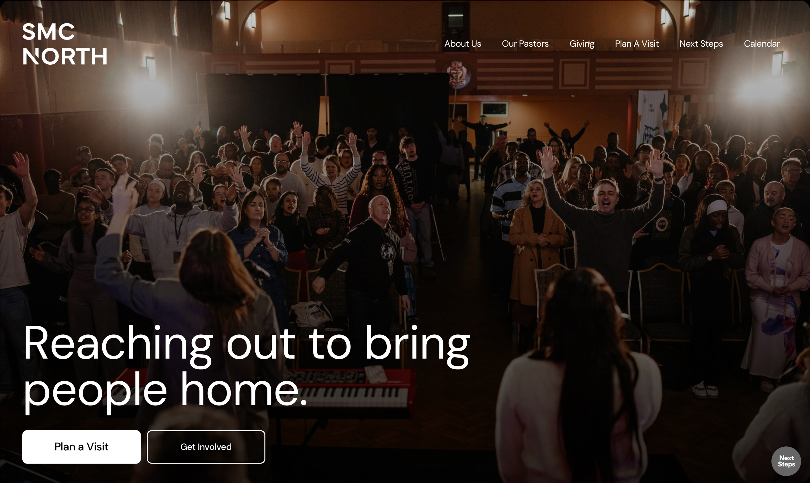
Here are a few real examples of successful hero sections.
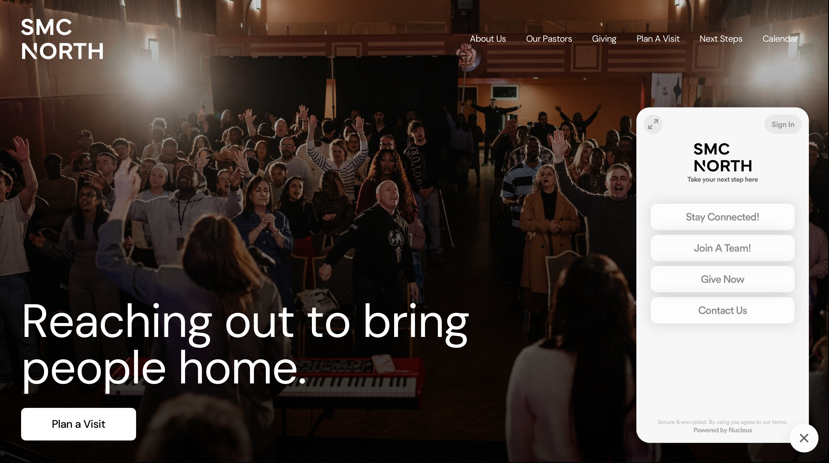
One strong option is a full-screen background image paired with a clear headline, supporting text, and two call-to-action buttons. This layout works best with a simple, uncluttered menu that stays tucked away in a collapsible button so the focus remains on the message and the image.
Another variation keeps the image full-width but moves the text to the bottom center of the canvas. This is especially helpful when your photo includes visible eyelines, such as a worship leader or pastor. Text should never overlap a person’s eyes. This layout also allows for a traditional on-page menu because the overall design is less crowded.
A third option places the text at the bottom left of the image with the calls to action directly beneath it. This works well when your photo composition naturally leaves space on one side of the frame.
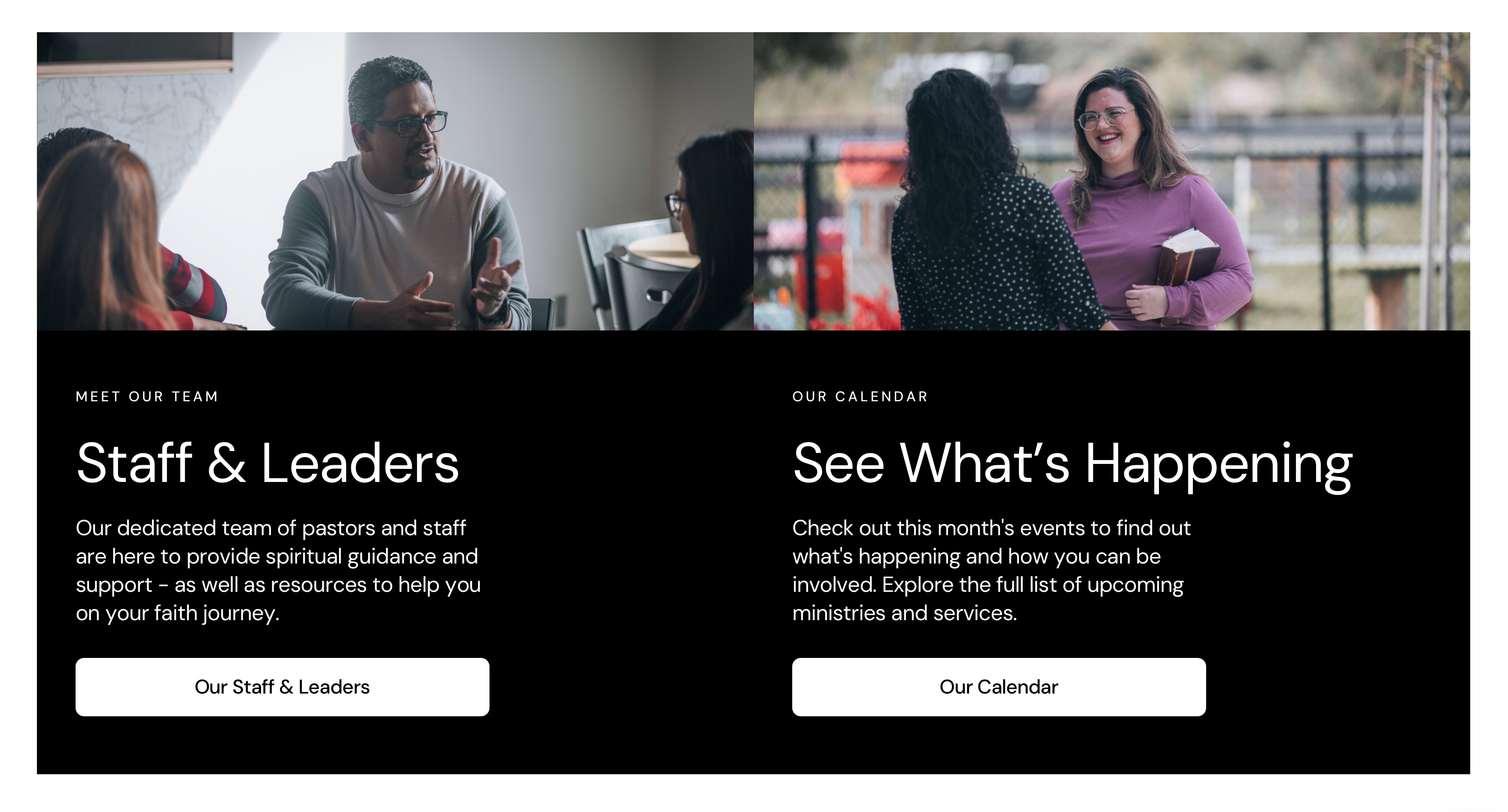
But what if you don't have a strong full-width image? In that case, a collage hero is a great solution. By combining multiple photos into a single mosaic, you can showcase different aspects of church life at once. This layout keeps the design visually interesting while avoiding reliance on a single perfect photo.
The thing that all four of these homepage examples share in common? They are all built with Nucleus, our website builder for churches. Nucleus as a platform is intentionally designed to prioritize invitation over presentation.
{{banner-2}}
Across all hero layouts, consistency matters. The logo remains in the top left. Navigation is easy to find. Every important next step is accessible.
Hero Section – Key Takeaways
Prioritize strong imagery with a clear next step
Ensure that the navigation is easily accessible
Make every next step always available
Making Next Steps Impossible To Miss
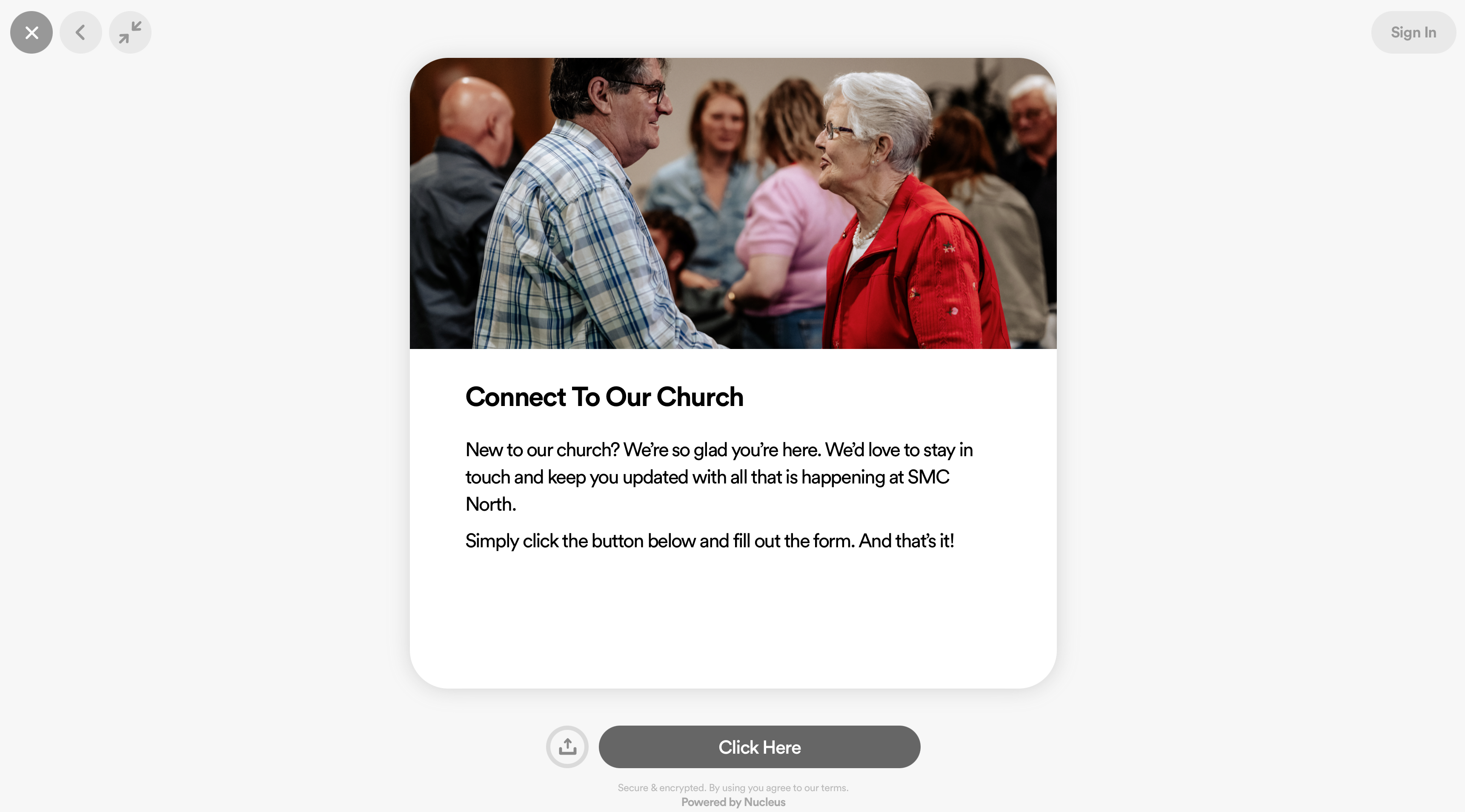
One of the most effective tools you can add to any church website is The Launcher by Nucleus. It’s a free widget that can be installed on any church website that facilitates any and every next step.
{{banner-5}}
This helps to ensure that the most important actions someone can take in your church are on every page of your site.
Instead of forcing visitors to hunt through menus, the launcher keeps options like planning a visit, watching messages, joining a group, or giving right at their fingertips. The result? More clarity and more participation.
Building The Rest Of Your Homepage
Once your hero section is doing its job, the rest of the homepage should flow naturally.
Here are the four sections that should follow:
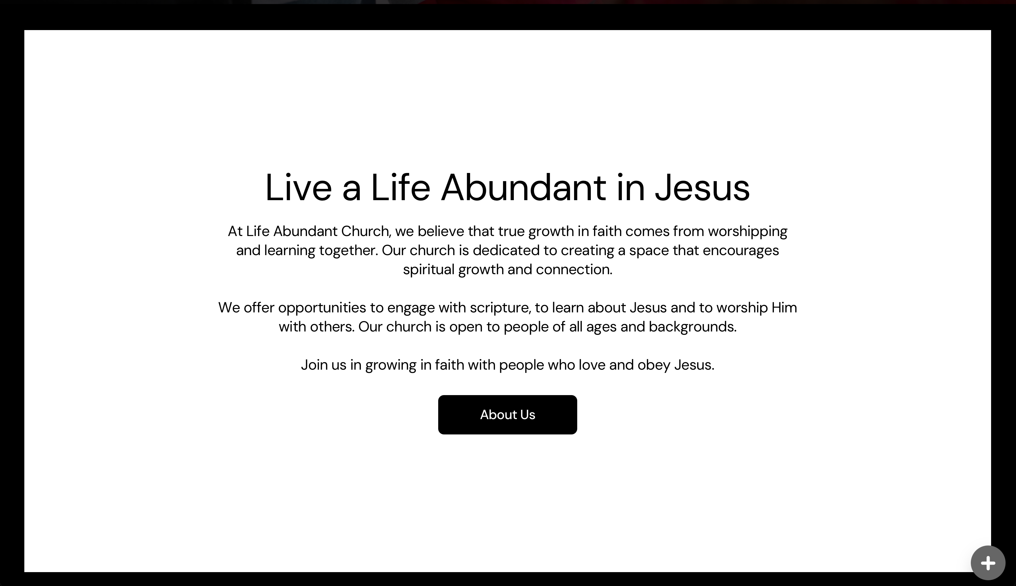
About Us
The first section after the hero should be a brief introduction to your church. This works best as a simple text section on a plain background. The contrast between a photo-heavy hero and a clean text section helps guide the eye and keeps the page from feeling overwhelming.
Plan Your Visit
Next comes a Plan Your Visit section. This should pair a photo with clear copy and a single call to action that leads into your visit planning flow. This is one of the most important invitations on your site, so it deserves a dedicated space.
Staff & Calendar
After that, a split section works well to highlight your staff and your calendar. Each side includes a photo, a short description, and a button linking to the appropriate page. This gives visitors confidence that your church is active, organized, and led by real people.
Next Steps
The homepage should then close with a Next Steps section. Structurally, this mirrors the Plan Your Visit section but flips the layout. Consistency in structure creates familiarity, and familiarity builds trust.
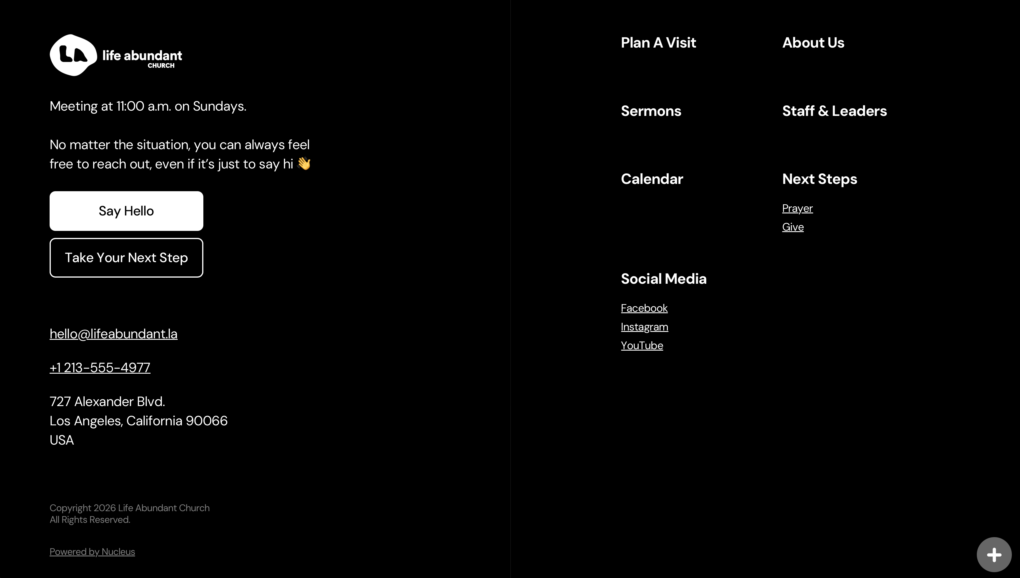
The footer follows as the final element, containing secondary links and information for those who want to explore further. Hot tip: make sure that your footer is available on every page of your church’s website. Keep prominent contact and location information there, so your visitors will never have to guess where and when you meet.
Here are those four sections one more time:
About Us
Plan Your Visit
Staff & Leaders
Next Steps
A Better Way To Build Church Websites
Websites have a reputation for becoming massive projects that drag on for months. They don’t have to. Let us do it for you.
Over the last year, we have built over 1,000 church websites makeovers for churches all around the world. The catch? We do it for free.
We'll design and build an entire site for you at no cost. Once the website is complete, the only ongoing responsibility is monthly hosting, similar to how a car requires fuel after you drive it off the lot.
More than a thousand churches have already gone through this process. Let us take the burden off of you and makeover your church website today!
{{banner-3}}
If your church website feels overwhelming or outdated, this homepage formula gives you a clear path forward.
Simple design, real photos, and clear next steps are inspiration, information, and invitation working together.
That is how a church website serves its mission, and fulfills your vision as a church.
If photography is the missing piece for your website, learning how to capture great photos with the tools you already have can make a massive difference. Check out this masterclass where I teach you how to take website-worthy photos with the camera that’s always in your pocket – your smartphone!
{{banner-4}}
Hey, It's Nice To Meet You
Hey there, I'm Brady Shearer. It's possible that some form of artificial intelligence brought you to this article, and if you made this far, I'll assume you're invested in this conversation.
I've been resourcing the church through Pro Church Tools for well over a decade, helping churches of every size navigate the communication shift of our time.
We publish weekly free resources on YouTube, our podcast, and Instagram, and we serve the church through our software called Nucleus.
{{banner-1}}
The Church Website Homepage Formula
Download this free formula, complete with wireframes + real examples.