The Nucleus Blog.
Guides, strategies, and resources from the Nucleus team.
Latest ArticlesMost Recent Posts
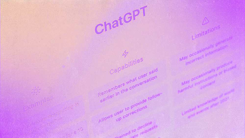
People Are Asking ChatGPT To Find Them A Church. Is Yours Showing Up?
People are using LLMs to search for a church to belong to. Here are 5 simple steps to show up in AI search results.
Apr 20, 2026
·
10
min read
People Are Asking ChatGPT To Find Them A Church. Is Yours Showing Up?


get coached by the founder
See Nucleus in Action. Watch this demo by Brady Shearer.
Build an entire website from start to finish.
How To

The Secret to Creating Memorable Church Logos (That Most Churches Miss)
Jul 14, 2025
·
7
min read
The Secret to Creating Memorable Church Logos (That Most Churches Miss)

How to Choose Your Church’s Brand Colors (The Right Way)
Jun 18, 2025
·
7
min read
How to Choose Your Church’s Brand Colors (The Right Way)

How To Write Better Church Email Newsletters (6 Rules)
Sep 1, 2022
·
9
min read
How To Write Better Church Email Newsletters (6 Rules)
Strategy
People Are Asking ChatGPT To Find Them A Church. Is Yours Showing Up?
Apr 20, 2026
·
10
min read
People Are Asking ChatGPT To Find Them A Church. Is Yours Showing Up?
Tutorials

How To Install & Setup Nucleus Prayer (Best Practices)
Jan 19, 2022
·
6
min read
How To Install & Setup Nucleus Prayer (Best Practices)

The Ultimate Guide To The Launcher By Nucleus
Jan 16, 2022
·
10
min read
The Ultimate Guide To The Launcher By Nucleus

How To Smoothly Switch Church Giving Providers [12-Week Plan]
Nov 2, 2021
·
9
min read
How To Smoothly Switch Church Giving Providers [12-Week Plan]
Product Updates


Nucleus Giving vs. Rebelgive: What’s The Difference?
Oct 24, 2022
·
8
min read
Nucleus Giving vs. Rebelgive: What’s The Difference?

Announcement: Storytape Joins Nucleus As Nucleus Media
Nov 19, 2019
·
4
min read
Announcement: Storytape Joins Nucleus As Nucleus Media